After years of development and months of beta testing, the Mariners’ Dashboard, NERACOOS’s improved way to visualize regional ocean data, is available from our homepage.
The Mariners’ Dashboard interface is a distillation of the buoy map’s most loved components (according to our users), integrated with favorite features from other areas of the site. Instead of visiting multiple pages, you can now find current conditions, observations, hindcasts, and forecasts all within a single panel, or ~dashboard~ if you will. See what we did there?
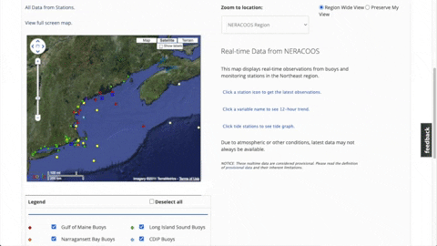
The Buoy Map button on the homepage has been replaced with a Mariners’ Dashboard button; clicking on it now brings you to the Mariners’ Dashboard landing page, which displays an interactive map with a quick snapshot of notable observations from the NERACOOS region.
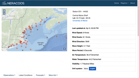
The landing page for the Mariners’ Dashboard displays an interactive map and snapshot of notable conditions. Clicking on a dot will bring up the latest conditions recorded by that asset, the most recent observations of which will always be shown in the table to the right of the map, with 12-hour trends in graphs below. Use the tabs to navigate to forecasts and view more detailed information for each type of observation, including 7-day histories.
The design of the Mariners’ Dashboard was driven by longtime NERACOOSers, and as always it’s our users’ thoughts that are most important. So, if you have feedback, comments or questions, please email us at [email protected] or reach out to us on social media. Should you encounter any bugs or errors while using the Dashboard there is a bug reporting form at the bottom of every page and on the Mariners’ Dashboard home screen.
To everyone who gave their time and expertise to help with development and testing, thank you so much! And thank you to the entire NERACOOS community for giving us purpose.
We hope you enjoy using this new tool!